


Welcome to the world of printing colors and their disappearing acts. This new world of color printing is a "must have" when it comes to packaging and branding, not a "nice to have." Taking the time to think of the color on your logo and packaging is important, as different shades at different points in the branding process can alter the message.
Colors can have a massive psychological impact. Believe it or not, around 90% of snap judgments about products come from colors. This is where systems like CMYK and Pantone color systems come into play, to help decrease the chances of getting the incorrect color in your packaging.
The purpose of this guide is to help break down what CMYK and Pantone are, what the differences are, and what is the best color system to use is. We will talk about what the best color system to use in a specific situation is, how they work together and share some pain-avoiding tips when it comes to printing. Once you have finished this guide, you will be in a position to make the best and most informed decision for your packaging color system, be it for custom boxes or custom labels. Let’s go!
Why Accurate Color Selection Matters For Brands And Packaging
It is a common and frustrating phenomenon when, after printing a perfectly made design, the colors change. A heartbreaking realization seems to summarize the whole question: Why has this changed? This is the reality of many brands. Color shift is becoming a major frustration in packaging and branding.
Studies show that 85–90% of people make a snap judgment about a product based purely on color. One wrong shade and your premium box suddenly looks cheap, or your brand feels “off” next to the competition.
What This Guide Will Help You Understand
This is exactly why printers and brands live and die by two color systems: CMYK and Pantone. They’re not interchangeable, and picking the wrong one can cost you thousands in reprints. This 2026 updated guide breaks everything down in plain English so you never waste money on bad color again.
CMYK Vs Pantone Differences
From unpacking CMYK and Pantone to running a comparison and giving tips in the industry, I’ll explain the value of one costing more but giving less trouble when printing brand logos, and the other in CMYK when printing photographs in bulk.
We'll touch on conversions, like hex to CMYK and Pantone, and link to related topics: What is PMS Color? and What is Packaging?
How are spot colors made? The ink factory mixes the inks according to Pantone’s recipe. The printer loads that exact premixed ink into its own dedicated station on press. No dot blending required, it prints as a solid, consistent color every single time. There is a reason why almost every large corporation has a Pantone Coca-Cola red, Tiffany blue, UPS brown, and Starbucks green, and it is as simple as this: The color looks the same, and there is enough consistency to sell out in CMYK on a shelf in Tokyo, Dubai, or New York.
Understanding Color Models in Printing
Colors in printing come down to how light works. There are two main types of models: additive and subtractive.
Additive Vs Subtractive Color Models

Additive models utilize light as pixels and add different colors to black. It's great for digital stuff, but it doesn't translate perfectly to print because paper reflects light differently. Subtractive models subtract from white light using inks or pigments. A strategy for subtractive color models +is CMYK, as well as Pantone.
They use a base color of white, such as the color of paper, and layer colored inks that absorb different wavelengths of light. They are mixing inks to achieve a lower level of light reflection. This is key for packaging because it mimics how we see real-world objects.
Role Of Color Accuracy In Packaging, Branding, And Commercial Printing
Color accuracy matters big time in branding and packaging. A slight shift in your brand's blue could make your logo look off on a box versus a website. Clients are unhappy when unused ink gets wasted from reprints, and in commercial printing, this is a common problem. Boxed consumables such as food have packaging whose color needs to match the color in the printing to improve the appeal of the product when it’s displayed. There are only two ways light and color behave:
- When using RGB color models, it’s white. Red + green + blue light is displayed. Turn everything off = black. Your phone, laptop, TV, all additive.
- Print uses in a Subtractive color of CMYK & Pantone . You start with a white sheet of paper and then you can do it by adding ink, you subtract light. More ink = darker color.
A computer screen shows the color blue, but a paper print is different, reflecting light in a way that gets overshadowed. To alleviate the guesswork, a lot of science goes into the color management aspect of packaging. 62% of brands have had to reprint entire runs because the color didn’t match (Pantone Color Institute 2025) Bad color drops “premium feel” by 21–38% (Luxury Institute 2025). Average reprint bill on a mid-size packaging job? $8,000–$15,000 in the US, I’ve seen it happen.
What is CMYK?
It is a color model which is used by printers to best type a wide spectrum of colors because of the smooth blending of the four colors, which can make the best print. It is the most common color model used in full color printing.
How CMYK Printing Works?
The four ink colors which are used in screen printing are blue green (cyan), a pink-red color (magenta), yellow and black. These are basic colors combinations; all colors are made. So combination these basic colors make the required color and it is used for printing.
Why CMYK is Used for Full-Color Printing?
This is also the method when printing black and white sketches, brochures, or magazines. Most offset and digital presses run CMYK because it's efficient for high-volume runs. 2026 real numbers: 87% of everything printed on earth is pure CMYK (InfoTrends 2025) Adding just one Pantone color on 10,000+ boxes adds $1,200–$3,800 extra Food pouches, Amazon mailers, cereal boxes — 95% of them run CMYK only.
Benefits of CMYK
Cost-effective: Standard inks mean lower setup costs—no custom mixes needed. Photos and Gradients: Shifts in color and contrast are easily handled.
Limitations of CMYK
Color inconsistencies. The output from different printers is a major variable. The quality of the ink and paper used are also major qualifiers for how vibrant or dull the finished product. Variations across printers and materials. If colors are printing on glossy cardboard, they are more vibrant. If they are printed on kraft paper, the opposite is true. There is a sharp loss of vibrancy when converting from RGB to CMYK reads during a screen presentation.
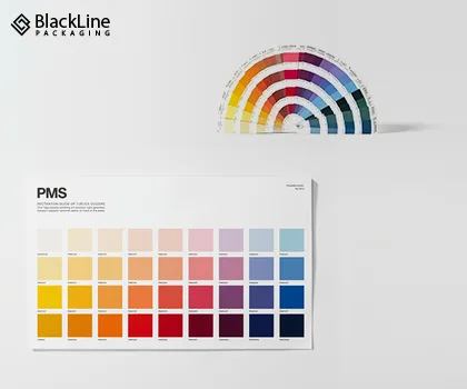
What is Pantone?
A color matching system, which is most efficient and perfect for printing, is called Pantone and is offered by Pantone LLC. PMS is the Pantone Matching System, which is universal dictionary for colors which has thousands of colors in its system 2026 stats that blow your mind: 73% of Fortune 500 companies lock their main brand color as a Pantone (Brand Finance 2025).
For luxury packaging, the usage of which is inserted in the system for metallic Pantones increased by 34% last year. For the cannabis packaging, which is very good for packing, the use of Neon/Fluorescent Pantones has increased 180% since 2022. Reprint percentage of CMYK jobs is equal to 11.2% For Pantone jobs, which is only 1.7% (Keypoint Intelligence 2025).
Meaning of Pantone and PMS
For each shade, each Pantone has its own code, which is given in the system, like Pantone 286 for a classic blue, and the system makes sure to print this color. They are all a precise formula of ink, not a mixture poured on a press.
How Pantone Spot Colors are Created?
It is Pantone spot colors, however, that are pre-mixed and used to print solid layers of a color, for which printers do not use dots. They are then scrupulously matched.
Why Brands Use Pantone for Consistency?
For example, Coca-Cola is a important brand that to be determined by on Pantone for its color red on their cans, ads, and shirts around the world. It is most important to mention that the company name on each and every product with Pantone means nothing specific; PMS, however, is the standard color matching system.
Benefits of Pantone
Predictably precise color: There are no surprises when it comes to consistency across runs and media. Specialty color inks: There are colors that are outside the scope of CMYK; such as, metallic, neon, and pastel color inks
Limitations of Pantone CMYK vs Pantone: Key Differences

The core split? Printing method. CMYK is process color, four inks layered in dots for broad ranges. Pantone is spot color, one ink per shade for precision. Printing method difference: Process (CMYK mixes on paper) vs spot (Pantone pre-mixed). Color Accuracy: CMYK has some variation, whereas Pantone is exact.
Cost: CMYK is more economical for larger runs, priced higher than Pantone, which is worth it for the brand. CMYK color wheel shows mixes from primaries; Pantone's is a swatch book for direct matches.
When to Use CMYK
Go CMYK for budget jobs with images. Books, brochures, posters, and magazines are ideal for use on CMYK printing. In packaging, use it for flexible films where cost matters over exactness.
When to Use Pantone
Pantone shines for brand logos, corporate identity, and packaging needing exact matches. It's a must for metallics or neons. For rigid boxes or labels, it ensures your color pops consistently.
Using Both: Hybrid Printing
Sometimes, combine them—CMYK for backgrounds, Pantone for logos.
Benefits for luxury packaging? Richer looks at custom boxes or labels.
How to Choose Between CMYK and Pantone
Materials: Cardboard absorbs more, muting CMYK; kraft needs tests; rigid holds sharp; flexible films twist colors. 68% of premium packaging now runs CMYK + 1–2 Pantone colors (Smithers 2025). Real example: Matte black rigid box, CMYK photo inside, Pantone rose gold logo outside → customer instantly thinks “this is expensive.” Pantone to RGB and CMYK conversions help bridge digital to print,but always proof.
Industry Applications in 2026
- Cannabis & CBD packaging → Use Pantone for brand trust and reliability
- Subscription boxes → Mostly CMYK to keep monthly costs low
- Beverage labels → Hybrid (CMYK photos + Pantone logo)
- Apparel hang tags → Pantone for brand color accuracy on different card stocks
Common (and Expensive) Mistakes to Avoid
- Designing in RGB and converting at the last second, colors shift hard
- Skipping contract proofs, you only see the problem after 10,000 boxes are printed
- Assuming “close enough” is fine for brand colors, customers notice
- Forgetting to tell your packaging partner you need Pantone colors, they’ll default to CMYK
Pro Tips from Blackline Packaging(2026 Edition)
- Always request a wet proof (actual printed sample), not just a PDF·
- Send physical Pantone swatches if your color is critical
- Build a brand style guide with exact PMS codes
- Test your colors on the actual substrate, kraft sucks the life out of CMYK
- Work with a printer who has an in-house color specialist (we do!)
Tips for Accurate Color Printing with Blackline Packaging
At Blackline Packaging, we review digital vs physical proofs to catch issues. Communicate expectations, send swatches.
Conclusion
Choosing right matters for impact, wrong color, wrong message. For packaging, Blackline Packaging recommends Pantone for logos, CMYK for fills. Consult pros early. CMYK gives you affordable, beautiful full-color printing. Pantone gives you bulletproof brand consistency and speciality effects that make customers say “wow.” The most rapidly growing companies eventually arrive at the point of hybrid printing, which is where CMYK is used when appropriate, and Pantone is used where the brand is vital.
Drop us a message at Blackline Packaging, we’ll look at your artwork for free and tell you exactly whether CMYK, Pantone, or both is the move in 2026. Pick wrong and you’re burning money and brand equity.
Pick right and your packaging becomes the reason people choose you over the competitor. Need this dialed in for your next run? DM or email Blackline Packaging, we review files for free and quote exact 2026 pricing for CMYK, Pantone, or hybrid.
Frequently Asked Questions
We've answered all the common questions you may have before ordering a custom box.
Is Pantone more accurate than CMYK?
Yes,for spot colors—it's formula-based, not mixed on press.
Why do brand designers prefer Pantone?
For global consistency; no variations.
Is Pantone or CMYK better to use?
It all be subject to on what you need. CMYK is enhanced for cost-effective creations, while Pantone is more precise.
How do I match Pantone with CMYK?
Use bridges or tools; proof it.
Is it possible to change CMYK to Pantone?
Find closest swatch; software helps but test.
Which color mode is best for print design?
CMYK is best mode and it can turn into Pantone, but it very less in practical.
How much is Pantone 286 in CMYK?
It is near 100C 68M 0Y 37K, however it can change, make use of the guides.
What does the name Pantone mean?
It is the name of the corporation; PMS is Pantone Matching Systems.
Is Pantone and RGB the same?
Definitely not, RGB is for screens printing and while Pantone is used for printing inks.